With NARCISSE you get 4 header variations. Each is very different and includes various visual effects. Below we explain them all, one by one:
Header A
- if used in a combination with a sticky header, this option allows you to set up a Zoom factor for the initial view (set it up to 300% by default). When you’ll be scrolling down the page, the logo will smoothly resize and and remain in its original size on the sticky menu.
- you have 3 options for burger menu icon.
- If you click on burger menu, it will open a full-screen popup that supports up to 3 menu levels (check Pages -> All Blocks).
You can see an example of this header on the main Home A page of the demo site.
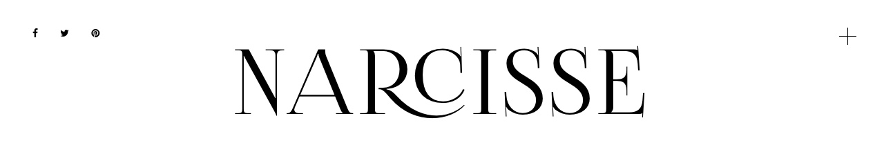
Header B
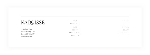
This menu is the most traditional one – with the logo in the center and a regular drop-down menu. You have full control over the colors and fonts here. You can see an example of this header on the All Blocks page of the demo site.
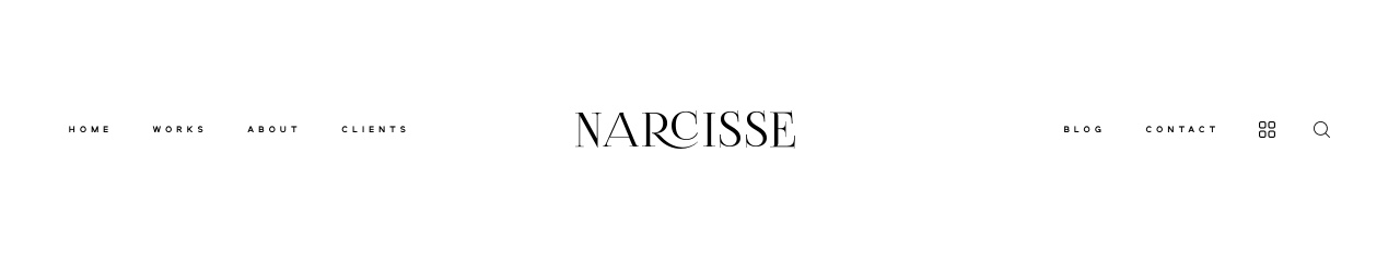
Header C
- Header C has the drop-downs with elements listed horizontally
- as an option you can select a more traditional drop-down option for this menu
- it supports a 3 level menu – check Pages -> All Blocks.
You can see the example of this header on the Contact page of the demo site.
Header D
- Header D provides you with 3 options for the burger menu icon
- If you click on the burger, it will open a full-screen popup that supports up to 3 menu levels (check Pages -> All Blocks).
You can see an example of this header on the main Home C page of the demo site.
All the headers can be combined with the Slideshows (they can be displayed not only above the slideshow but over them) and with some other blocks that support this option – for example Featured Work block (check Home C page ) or Featured Item block (on Blog A).
Footers
In the footer builder you have 3 areas that you can use to create your site footer. You may include only one of the available areas, two or all three of them.
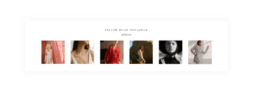
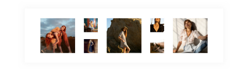
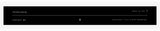
The first area is the Instagram feed and it has three design options:
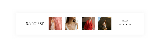
The second area of the footer is more informative with links and text areas, it provides 2 design options you can choose from:
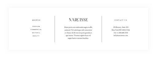
The second area also includes a placeholder for your widgets in case you want to use them in the footer.
The third area is a copyright area, it can be used for a more minimal look:
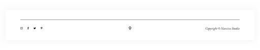
If you browse the Demo site pages, you can see that we used various combinations of the 3 available footer areas across the site pages (for example the current one has only Copyright Type B area) .